Advanced Sheets
Enterprise
✏️ By using advanced sheets, you can perform cross-analysis to classify and compare responses based on multiple questions.
Basic Interface
Scroll Lock
Free Scroll: Scroll freely in any direction.
Align Scroll: Scroll in a fixed direction.
Reset: Reset settings to default.
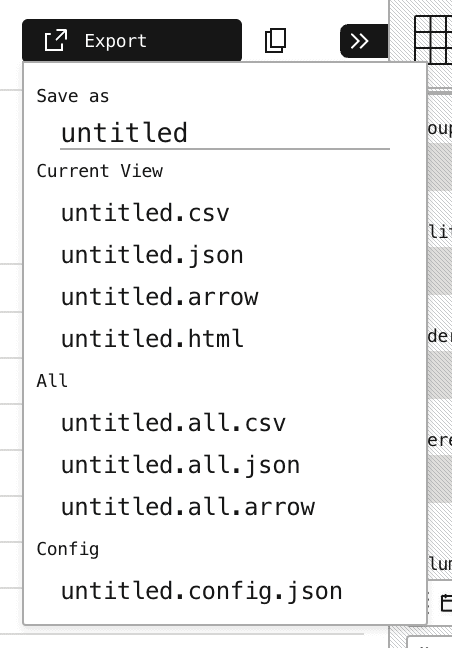
Export: Export data.
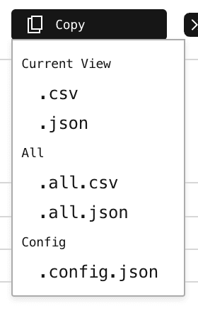
Copy: Copy Data.
Edit
Format: Set bold, italic, and hyperlinks.
Color: Customize text color and background color of columns.
Timezone: Change the base region for timestamps.
Date Style: Modify the date display format.
Time Style: Adjust the time zone display format.
Hide: Hide selected elements.
Unhide: Cancel hiding.
Edit: Same as (e).
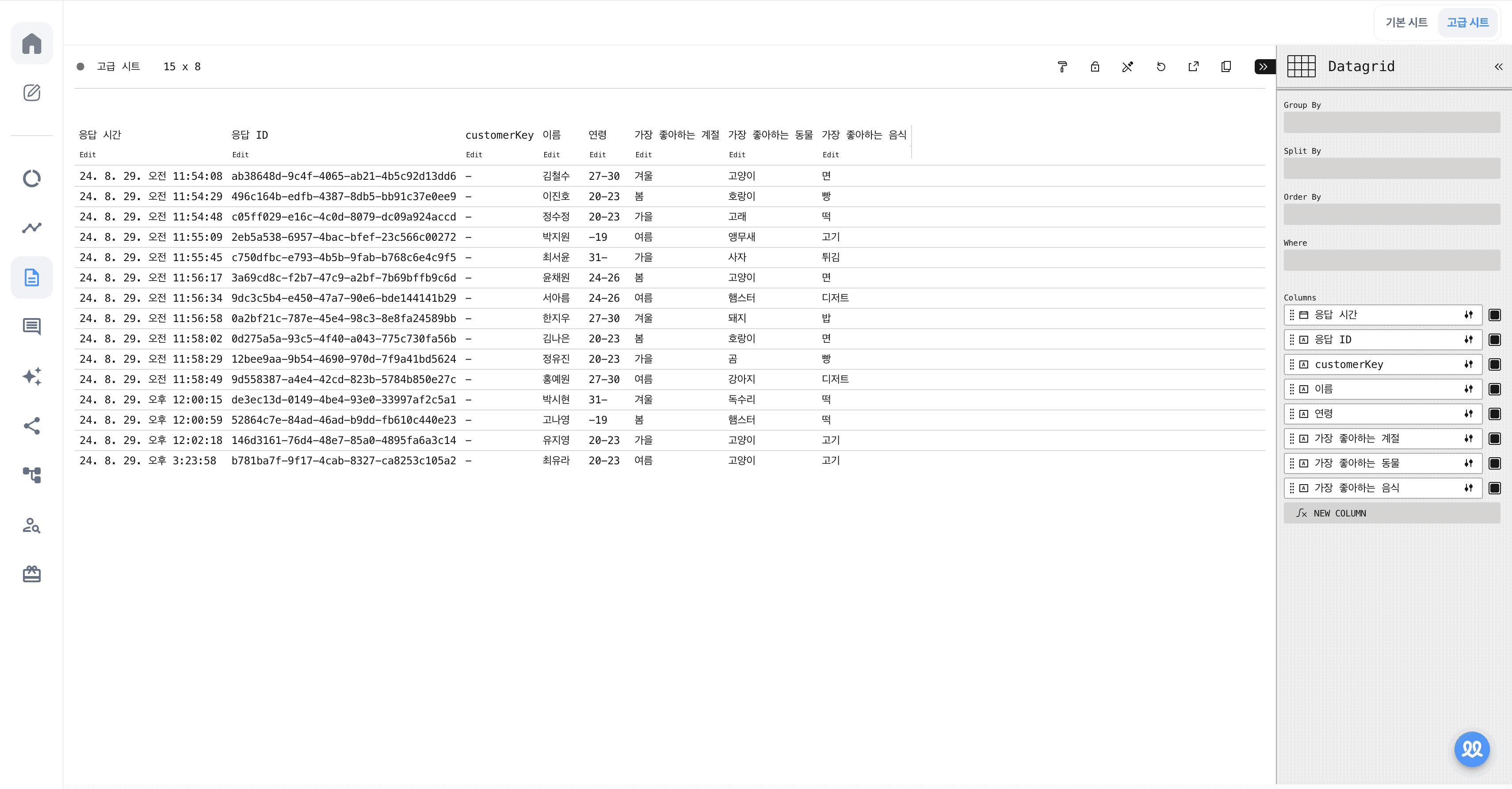
Setting Viewing Criteria
Group By: Group multiple data points together for better analysis.
For example, by grouping age and favorite season, you can quickly identify combinations like:
People aged 19 or younger who like spring
People aged 27-30 who like summer
This allows you to quickly identify individuals who meet multiple conditions.

At this point, you can see changes in the Columns section.
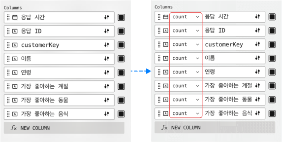
Currently, the data is displayed as a Count, so when you move it to Group By, the response values are shown as numbers. However, by changing this setting, you can view a variety of values in the sheet.
✏️ Here’s the meaning of each condition for the columns:
any: A random value from the responses that match the condition.
count: The total number of responses that match the condition.
distinct count: The number of unique types of responses that match the condition (i.e., the number of distinct "joins").
dominant: The most frequent response among those that match the condition (the value with the highest frequency).
first: The first response submitted that matches the condition.
join: The unique responses, excluding duplicates, among those that match the condition.
last: The last response submitted that matches the condition.
last by index: The last response submitted from the unique values of responses that match the condition.
median: The median value based on sorting the responses according to the condition.
unique: The responses where only one unique type exists, meaning there is no repetition within the condition.
Split By
Previously, the title column displayed the response time and question. However, by using Split By, you can change the items that appear in the title column.

By setting Split By to "Name," the sheet is now categorized based on the respondents' names.
Order By
By using Order By, you can sort the sheet based on the selected item.

By setting Order By to "Name," you can sort the sheet in alphabetical order. You can also click the red icon on the right to toggle between ascending or descending order.
Where
By setting Where, you can filter the responses to only display those that meet the specified condition.

By setting Where to "Favorite Season" and specifying the condition value as "Autumn," you will only see responses that include "Autumn."
Types of Charts

Datagrid: This is a table-format chart type that we previously reviewed.
Treemap

A chart type used to visualize hierarchical data, represented with nested rectangles. The size and color of the rectangles make it easy to visualize proportions and relationships within the data.
Sunburst

A chart type that visualizes data in a circular shape, often used to show how each data item contributes to the whole. It is particularly useful for displaying hierarchical data and the relative proportions of each segment within the structure.
Heatmap

A chart type that visualizes data values using color. The intensity or tone of the color changes based on the value size, making it easy to identify patterns or trends in the data visually.
X Bar

A chart type used to visualize data comparisons along the X-axis, commonly known as a horizontal bar chart. Multiple fields can be added to the X-axis, allowing for the comparison of various data points in a clear, horizontal layout.
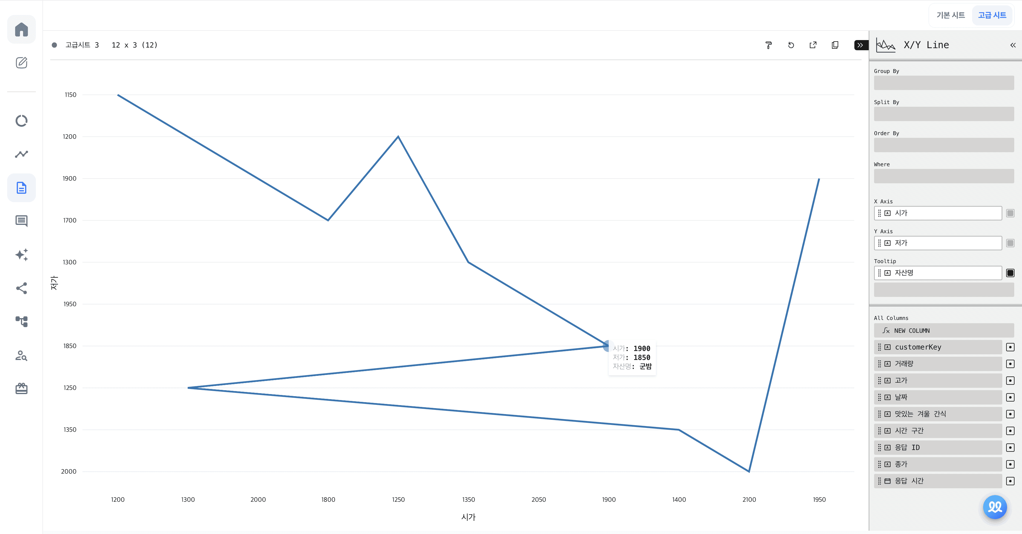
X/Y Line
X/Y Scatter

Y Bar

A chart type used to visualize data comparisons along the Y-axis, commonly known as a vertical bar chart. Multiple fields can be added to the Y-axis, allowing for the comparison of various data points in a clear, vertical layout.
Y Line

A chart type that visualizes data by connecting corresponding values on the X-axis and Y-axis with a line. This is commonly used to display trends or patterns over a continuous range of values.
Y Area

A chart type that represents values as an area, typically used to show changes in data over time. It is similar to a line chart, but with the area under the line filled in, which helps emphasize the magnitude of values and changes over time.
Y Scatter

A chart type that plots data points on the X-axis and Y-axis, creating a scatter plot. It is commonly used to identify correlations or relationships between two variables.
OHLC
The OHLC chart stands for Open, High, Low, and Close, and is used to visually represent price fluctuations of assets over time. It is widely used in financial markets to show the opening, highest, lowest, and closing prices within a given period.
m. Candlestick
Similar to the OHLC chart, the Candlestick chart is used to represent price movements of assets visually. It displays the opening, closing, highest, and lowest prices in a given period, with the body of the "candlestick" indicating the range between opening and closing prices, and the "wicks" representing the high and low prices.